


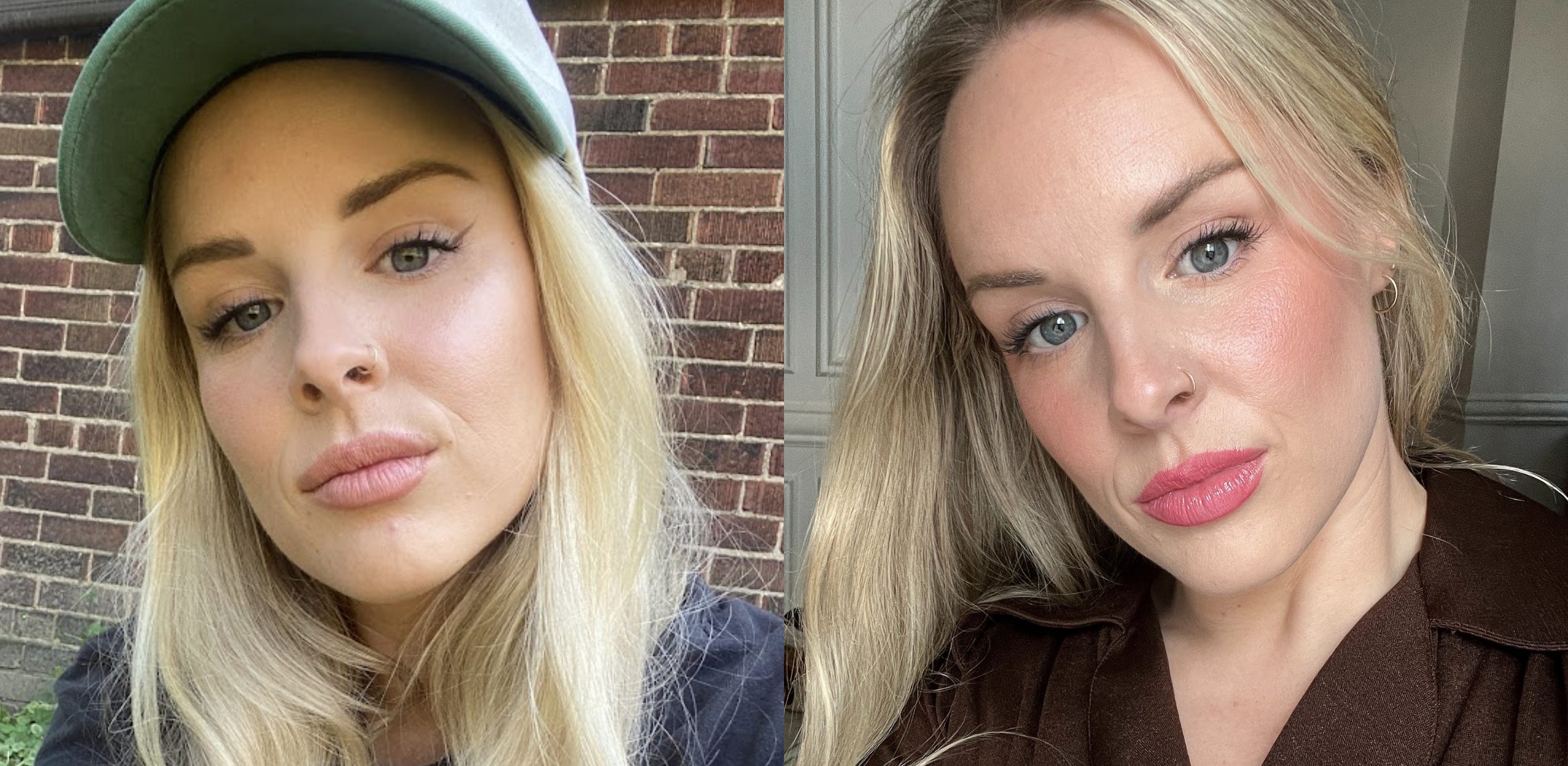
I can’t remember the first colour analysis TikTok that crossed my path, but by December 2023, my entire camera roll had turned into a sea of “colour analysis filter” screenshots—my face surrounded by little colourful rainbows for me to carefully analyse which filter made my eyes pop the most, made my skin look the brightest, which colour palette felt the most like me. (And despite trying literally every filter, I still had no clue which season actually suited me.) *v flattering image incoming lol.

The idea that each person has a unique palette of colours that enhance their natural features—their hair, eyes, and skin tone—completely fascinated me. And Ryan, being the most incredible boyfriend EVER, surprised me with an IRL colour analysis session for my birthday last April. It was awesome.
I booked with Samantha Dempster—A personal stylist and colour analysis expert from Toronto. (And if you use the code AUTUMN10 you can save 10%- BTW she can also do these sessions virtually using photos! I also had her as a guest on the Season’s Podcast, be sure to watch this episode where we dive more into her personal journey and hear some of her best styling tips.)
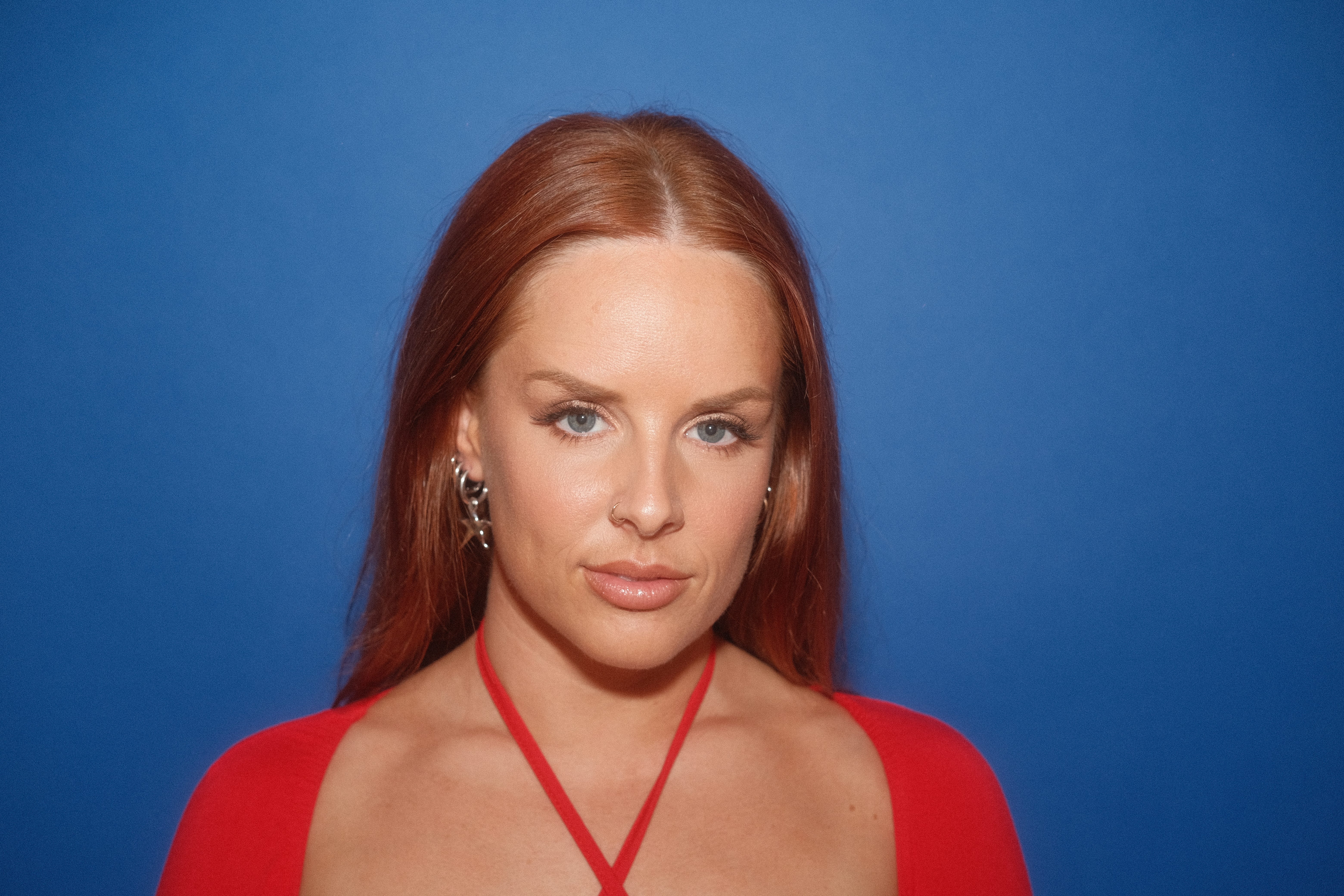
Samantha came to my apartment, I donned a little white cap (very chic), and we draped colour after colour in front of my full-length mirror in my living room. That’s when I witnessed—firsthand—the POWER of colour. I had no idea how dramatically different shades could impact how I looked. Some colours brought me to life, making me look bright-eyed, clear-skinned, and radiant. Others? I looked like the actual crypt keeper—bags under my eyes, double chin, grey skin. LOL.
As someone who naturally leans on the pale side, I quickly realized that some colours are just simply not my friend.
In that one-hour session, I learned that I have warm undertones—which, fun fact, I had no idea about. And apparently, that little detail impacts every makeup decision you’ll ever make. (That’s why foundation bottles have all those undertone options—fair skin with neutral undertones, light skin with rosy undertones, etc. MIND. BLOWN.)
Being a warm undertone also means I’m more of a gold girlie than a silver one. BUT—one thing I love about colour analysis is that it’s a tool, not a rulebook. I own and love a lot of silver jewellery, so I still wear it. But knowing that gold is technically more flattering for my skin tone? Good to know.
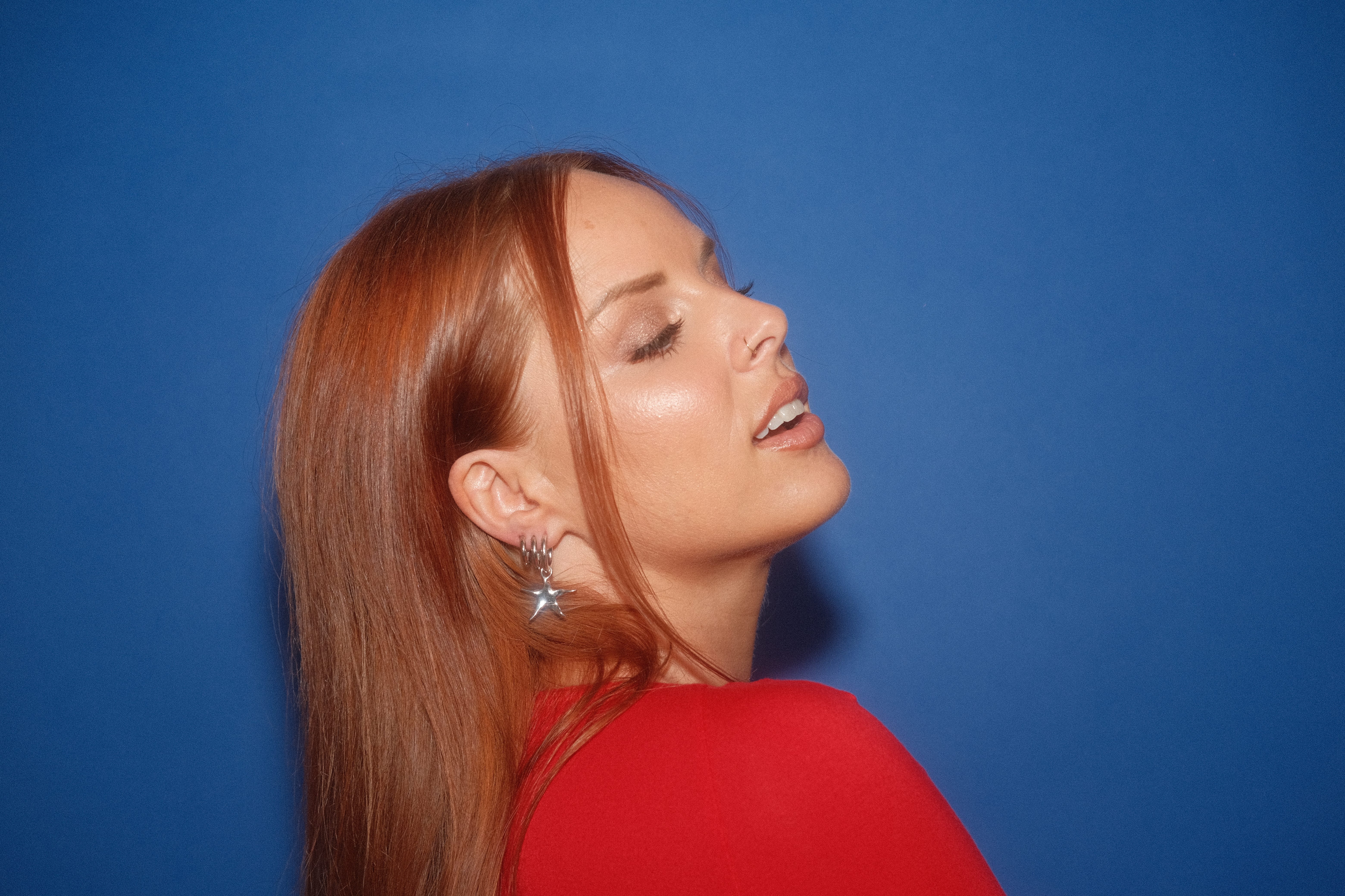
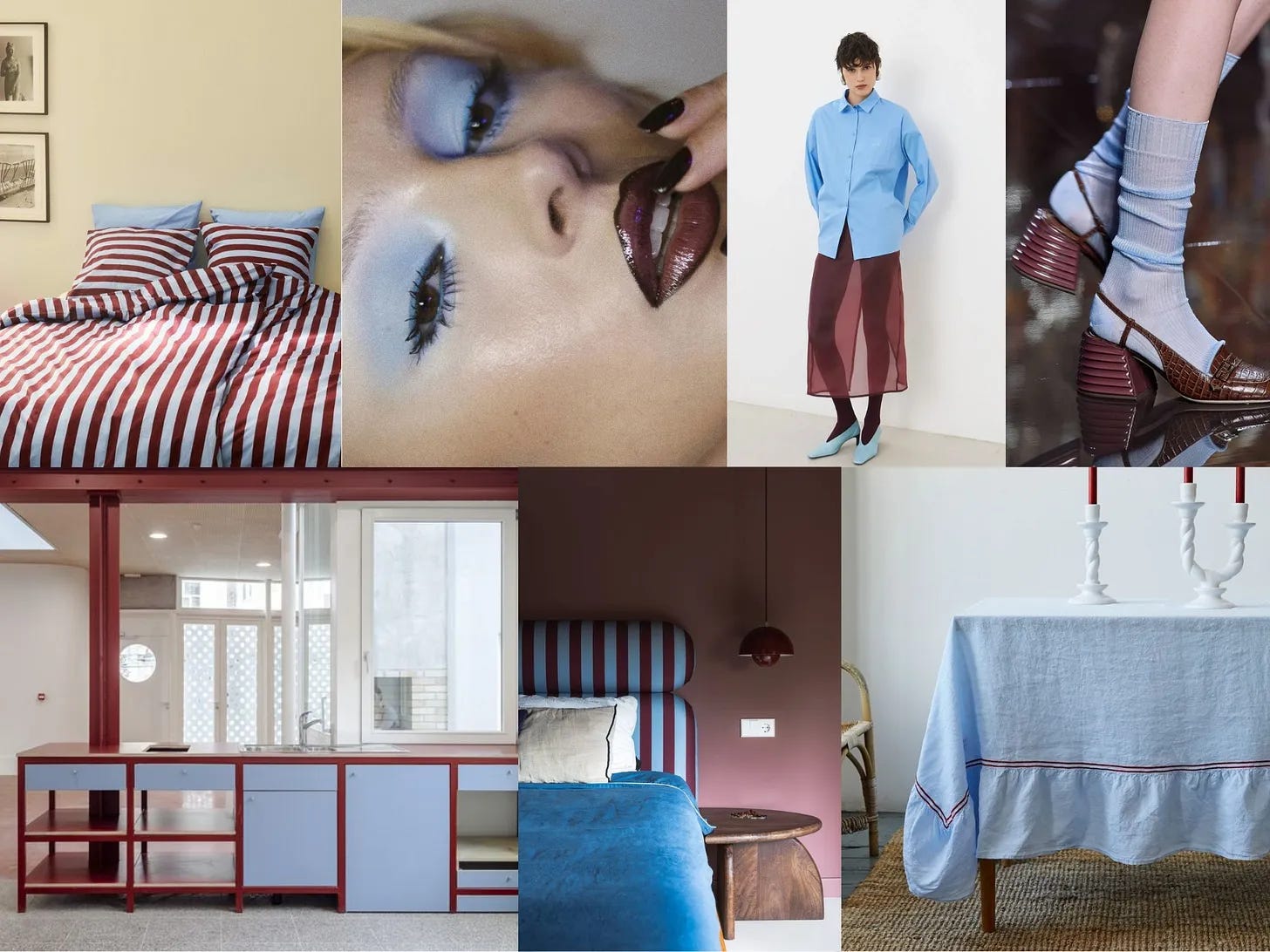
So after months living in colour purgatory I finally found out my palette: TRUE SPRING—the brightest warm spring palette.

It’s extra clear, light, and warm, meaning these are the shades that naturally enhance my features and make me look the most *~*radiant.*~*
After getting your colours done, Samantha gives you a little guide for your season—a PDF packed with tailored suggestions for clothes, makeup, and more. And one of the VERY FIRST THINGS I did? Swap my lipsticks.
I had been using MAC’s Creme Cup for literally my entire adult life—a cool, light pink shade that, in hindsight, completely washed me out. The moment I switched to See Sheer- a brighter, warmer pink? Immediate glow-up.
I actually love playing with makeup, but for years, my selection has been… well, weak. (It was only a couple of years ago that I finally retired my OG Naked Palette—if she could talk she’d have some stories to tell LOL.) But moving into SS2025, babyyy, I am ready to PLAY.
She’s feeling bold, confident, and ready to get experimental with makeup.
And luckily for me (and for you), if you know your colour season, Samantha just dropped an INSANE makeup guide for each palette.

Each seasonal guide includes over 150 product suggestions.
The perfect foundation & complexion products to match your undertones.
Eyeshadow shades & palettes to define your eyes.
The most flattering Blush & Lip colours - say goodbye to trial and error!
Never be swayed by a Sephora salesperson again!
The guides are UNDER$40 (!!!), but honestly? THEY ARE ACTUALLY PRICELESS.
(Use the code AUTUMN10 you can save 10%)
I went like 15 years wearing the wrong lipstick shade, don’t let that be you.
TRUE SPRING NAIL INSPO:

I also started to inject more colour into my life was through my nails. I started experimenting with bolder, more creative shades, using them as a fun way to add pops of colour to my style.
Another revolutionary part about colour analysis?
Knowing your best hair colours.
I’d been curious about changing my hair colour forever, but I’d been blonde my entire life. Well, other than in highschool when I dyed my side part bangs brown and did chunky brown highlights.. or that one time I box-dyed my hair brown after telling my mom I wanted to try it. We were standing in the Walmart hair dye aisle, and I was about to bail when she literally started balking at me like a chicken—balk, balk, blak! So, naturally, I had to do it. It was basically purple and patchy- I had a huge blonde patch I missed lol hated it. Ended up at the hairdresser to get it fixed. Speaking of begging the hairdresser to fix my hair, we all remember my Covid Kelly Clarkson highlights. I digress.
Changing my hair colour has always been in the back of my mind but committing to a colour was just too much pressure- how could I be sure it would look good esp given my previous hair traumas!? I kept seeing blondes on TikTok take the cowboy copper plunge, and colour analysis suddenly felt like a permission slip to get experimental.
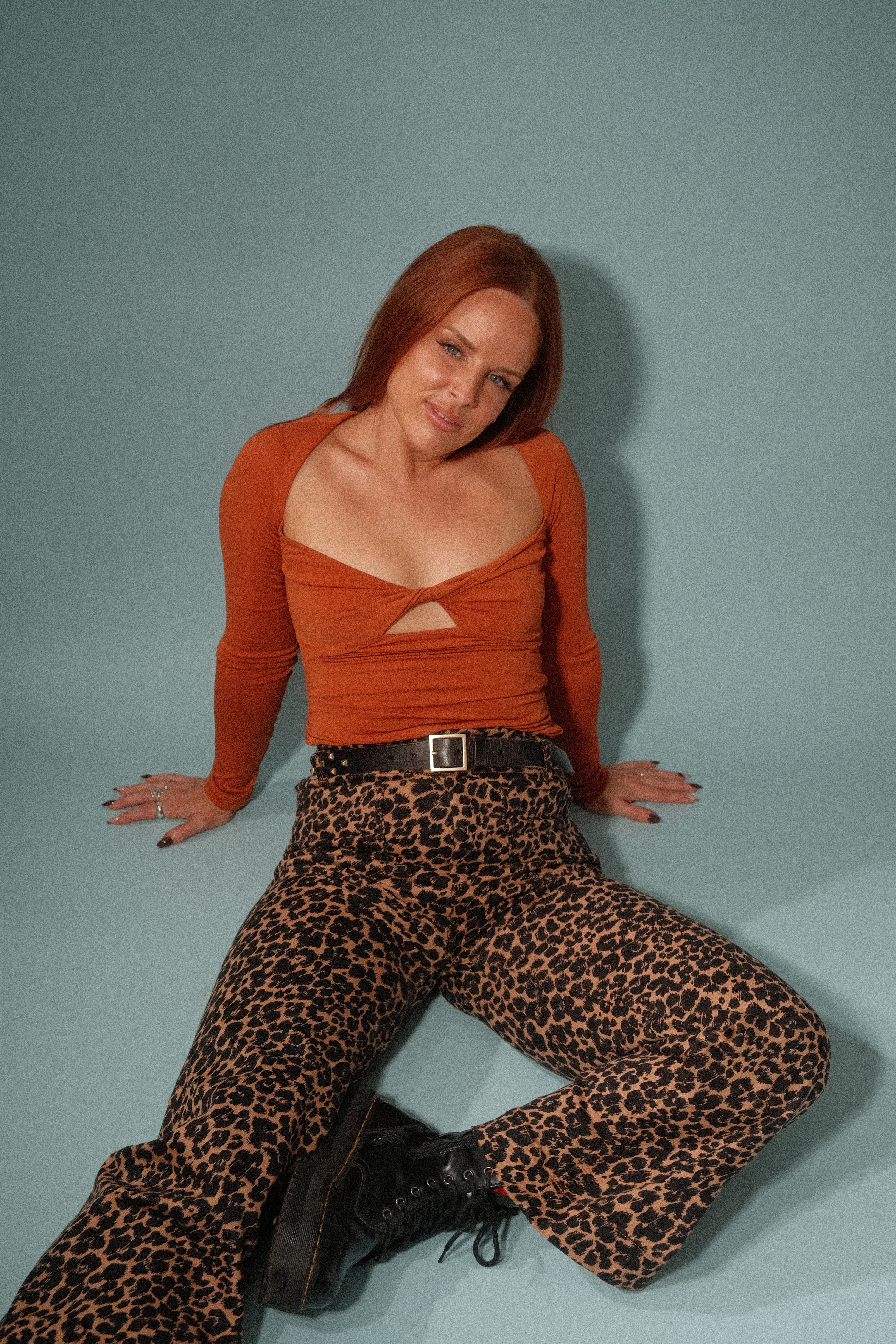
So I did it. My hair has now been several shades of copper:
My hair journey:
My initial Cowboy Copper Inspiration:

THE REVEAL:
↓

My many shades of copper:


I did my colour analysis around the same time I did my branding- so naturally I planned an “on brand” shoot with Ryan for my website which was also inspired by colour analysis. (More on the link between my personal style, home and digital world soon!) *The images below are when I went slightly more brown/less red.
.. and now having been copper for the last almost ten months (wow!).. I am ready for a change.. I’m thinking strawberry or buttery blonde for Spring. (options below!!)
WARM HONEY BLONDE
The top row is my OG blonde colour for reference, which is definitely super bleach blonde.. just below it is my option #1, which is a warmer honey blonde.

STRAWBERRY BLONDE
Another option is to go strawberry blonde.. which I also like, but, my hair did kind of fade into a colour similar and I *didn’t* like that so that is my only hesitation.

Overall though, I think I want to go warmer and lighter for Spring/Summer!
PLEASE VOTE :)
↓
If you caught my last post on my style evolution, you already know that self-expression through style is huge for me. I value individuality, doing my own thing, and living in full alignment with my authentic self. So when I discovered colour analysis, it felt like another data point in my ongoing mission to cultivate a style that is deeply my own.
In a recent Substack, I talked about how I’ve always struggled to pin down my personal style. When it comes to colour, I’ve been all over the map—from soft beiges and pinks to mustard yellows, leopard print, and literally everything in between. My style has gone through so many distinct eras, with tone words ranging from boho to bold, edgy to whimsical, feminine to sporty.
Because I’ve worn it all, I often felt completely lost about what I actually liked. But by mining my own data, I started to notice patterns—common threads that connected the pieces that made me feel the most me. And from there, I was finally able to start narrowing down my tone words.
Edgy, Bold, Playful. That’s the vibe.
The times I feel most alive in my outfits are when I feel confident, empowered, and undeniably cool.
The thing about cultivating your own style is that the options are endless—which can make shopping overwhelming when you don’t have a clear sense of what you actually like. But now that I’ve nailed down my three words and paired them with my colour season?
It’s over for you bitches. (lol jk)
But honestly, it feels like I’ve unlocked a personal blueprint that’s going to help me shop more intentionally and curate outfits that are uniquely me. It’s less about restriction and more about empowerment—giving me the permission to be more fearless with colour and to get more curious about clothes.
I’ve started thinking about style the same way I approach interior design, and it’s wild to see the two worlds start to collide.
Anytime I’ve taken on an interior design project, it’s always started with strategy—lots of research, followed by defining project tone words that set the mood and guide the senses. Once the strategy is locked in, the colour palette naturally starts to take shape as an extension of that vision. And from there, shopping becomes so much easier. Instead of being swayed by every trendy colour combo that blows up on Instagram, you have a clear framework that keeps you anchored to your original vision.
Applying that same approach to my personal style is going to be a game changer. Now that I have my three words (Edgy, Bold, Playful) and my colour season, I’ve essentially created a filter for shopping.
Instead of feeling overwhelmed by thousands of options, I apply the colour filter first, then layer on the tone word filter—instantly narrowing my choices and making every purchase more intentional.
It’s strategy-driven style, and it just makes sense.
SO WHAT’S NEXT IN AUTUMN’S STYLE REVOLUTION?
A hair update! Weigh in on the options!
Recategorize all my clothes in the Indyx app.

I am going to be so extra about it and get ryan to shoot them on a seamless with lighting because I also want to create an analogue closet- more on that later. (This mostly applies to my vintage pieces as for the ones from regular shops I’ve just grabbed the images from the websites).
A makeup overhaul!
Creating a shopping list to fill the gaps in my wardrobe with a major emphasis on weird and cool colour combinations.
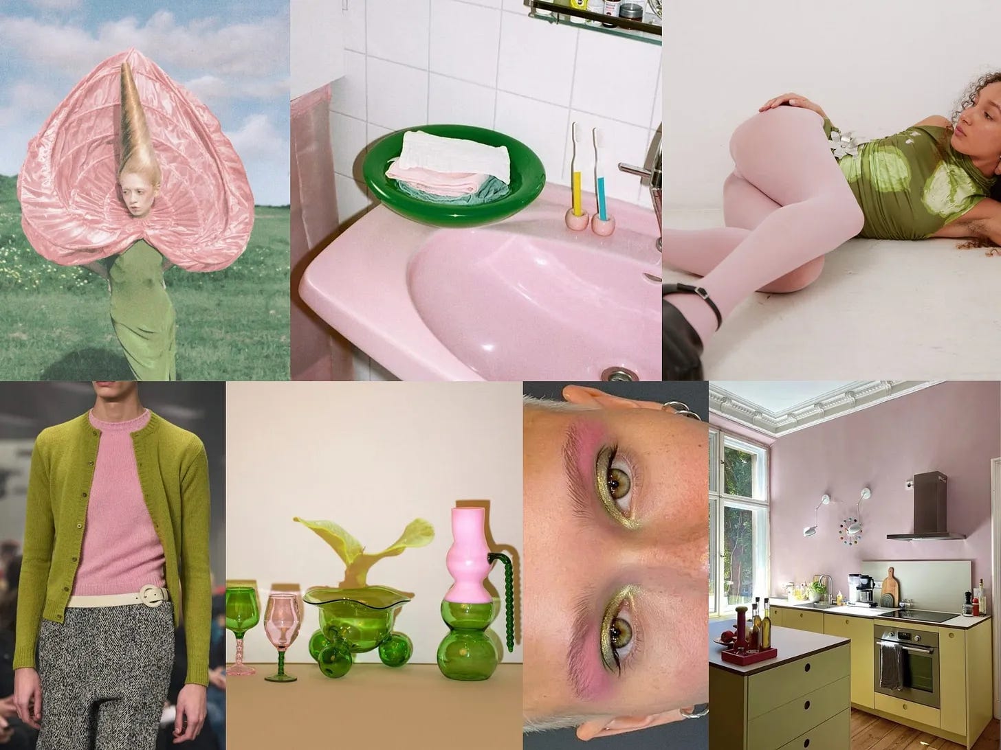
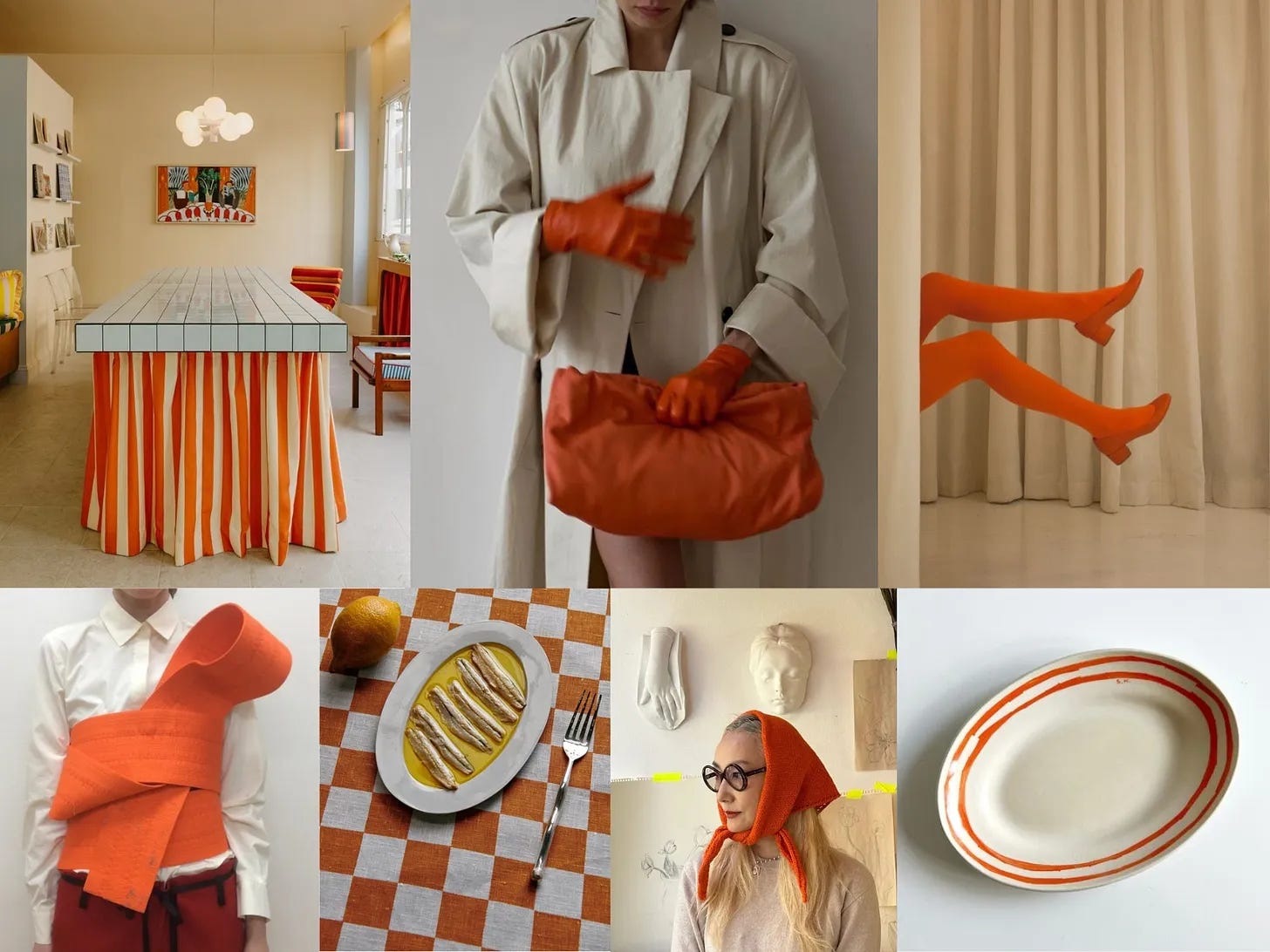
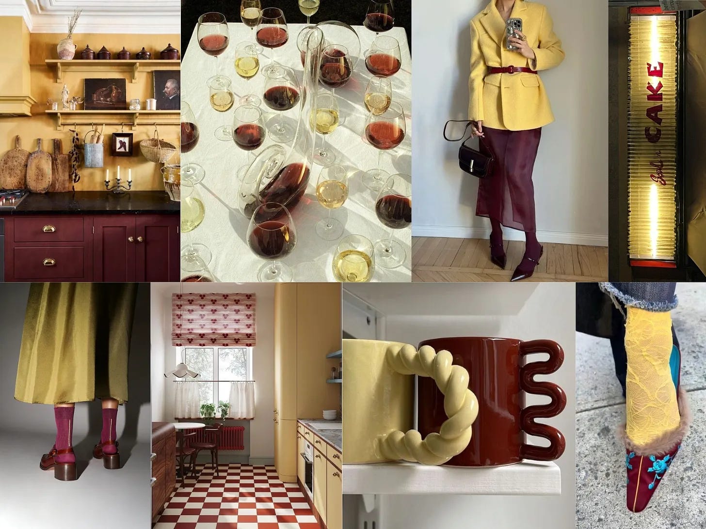
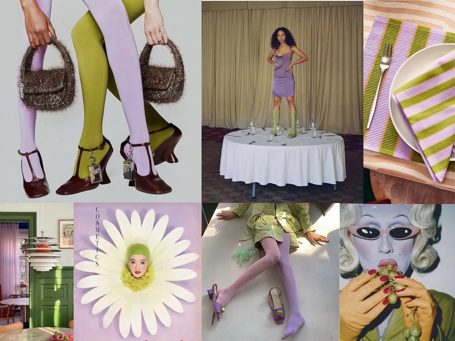
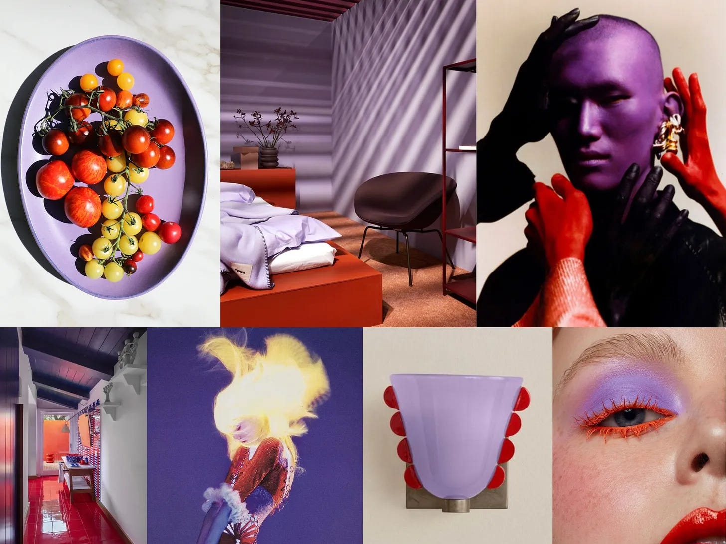
Speaking of weird and cool colour combinations— I discovered Kayla Roola Art here on substack, she has a page called “No Crumbs” filled with all kinds of colorful inspiration.. but specifically, she has a series called: a color combination I love, a food pairing I’d hate.
She calls it color theory meets nightmare pairings for a little food x fashion chaos. (lol).. With combos like watermelon and wasabi, or lavender and asparagus. I’ve included a few of her AMAZING mood boards below- eye candy for DAYS. Be sure to give her a follow here! (Lots of true spring colors!)
Thanks for being here! :)
